ILLUSTRATION & VISUAL CULTURE
Designing a Magazine Cover for Computer Arts Thailand
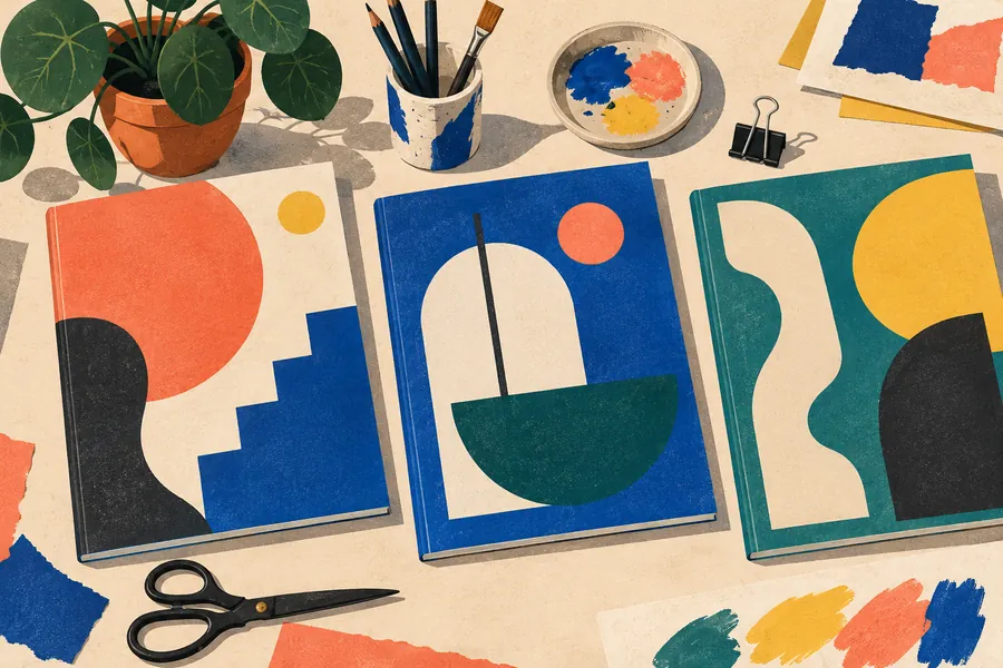
A cover for a design magazine is one of the most demanding briefs an illustrator can get. The readers are designers, so every decision about type, colour and composition will be noticed. Computer Arts, the long-running design magazine, was published in several international editions, including one for Thailand, and its covers were often handed to illustrators rather than photographers. Here is how a commission like that works.
The brief
A cover brief usually arrives with fixed elements and open questions:
- Fixed: the masthead, its position and colour rules, the barcode area, the issue number and price, and space for cover lines.
- Open: the image itself, often linked to the issue’s main theme, and sometimes special print finishes.
The first job is to read the brief for what it does not say. Which part of the cover will be hidden by the masthead? Where will the cover lines sit? Will the magazine be seen on a news-stand shelf, where only the top third shows?
Thumbnails and the big idea
Strong covers rely on a single clear idea that reads at thumbnail size. Illustrators typically present three to five small sketches:
- A literal interpretation of the issue’s theme.
- A metaphor that says the same thing more playfully.
- A typographic or pattern-based solution that works with the masthead.
The art director usually picks one direction and asks for a tighter sketch at full size, with the masthead and cover lines placed on top.
Colour and print
A magazine is printed in CMYK, and saturated screen colours, especially bright blues, greens and oranges, can turn dull on paper. Professional illustrators:
- Work in a colour space agreed with the printer and check proofs.
- Avoid placing fine detail where the binding or trim will cut.
- Leave bleed beyond the trim edge on all sides.
- Ask early about special finishes such as spot varnish or foil, because they need separate artwork layers.
Working with the masthead
On a design magazine the masthead is part of the composition. Characters can overlap letters, patterns can run behind them, and the illustration can echo the masthead colour. What the illustration must never do is make the title unreadable.
Lessons for illustrators
- Design for the shelf: the cover should read from two metres away.
- Keep layers organised and named; the art director will ask for changes.
- Deliver the final file at the right size and resolution, with a flattened preview for approval.
For another side of editorial work, read what design magazines look for in an illustrator.