ILLUSTRATION & VISUAL CULTURE
Character Design Basics: Five Tests Before You Add Detail
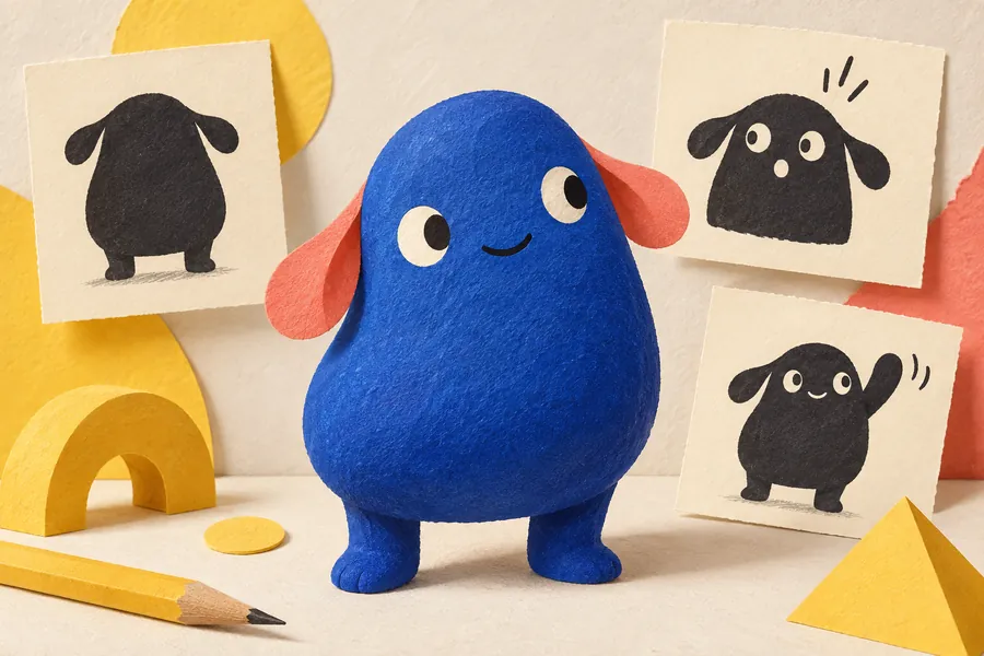
Character design basics become easier to judge when the drawing has a job to do. A character may look convincing on a large canvas but lose its expression in a small sticker or become unrecognizable from the side. Testing those situations early saves polishing a design that only works once.
Use the following exercise for an invented character: a curious creature helping visitors find their way around a neighborhood arts event. It is a practice brief, not a commission for an existing festival. Our festival character guide explains the wider identity system; this article focuses on reviewing the drawing itself.
Test one: the silhouette
Start with three small black shapes rather than three fully colored drawings. Give them different proportions: perhaps a broad body with short legs, a narrow body with long arms, and an almost square body with a large head. Keep the same job and personality across the variations.
Look for a clear outline and useful negative spaces. If a raised arm merges into the head, move it before adding fingers. Adobe’s emoji design walkthrough provides one example of building a recognizable small character from basic shapes. The exercise here is to ask which silhouette supports your brief, not to assume one shape communicates the same personality to every audience.
Test two: the smallest real use
Place the favorite sketch in three rough layouts: a poster, a square social image and a small sticker preview. Use the intended output sizes where known. Otherwise label these as provisional tests, then replace them when the client confirms the specification.
Inspect the exported images at their displayed size. If an eyebrow disappears, it cannot carry the whole expression. If a patterned jacket turns into noise, simplify it for the small version. Keep a note of which details are essential and which can be removed. A deliberate simplified version is more useful than repeatedly shrinking the master drawing and hoping for the best.
Test three: an action without a caption
Draw the creature pointing, waiting and carrying a sign. Cover any text and ask someone to describe each action. This is informal feedback, not a scientific test; its value is in revealing a mismatch between what you intended and what another viewer sees.
For the pointing pose, try changing the shoulder, torso and direction of the gaze, rather than only moving a hand. For waiting, compare an upright stance with one that visibly shifts weight. Save rejected sketches beside the selected ones and annotate the reason for the choice. Those notes become more useful than a folder of unexplained alternatives.
Test four: expressions that remain the same character
Make a neutral, pleased, puzzled and surprised face while preserving the main proportions. Mark reference lines for the eyes and mouth if they help. The goal is a range of expression without accidentally introducing four different creatures.
Check the expressions on the whole body, too. A worried face attached to a celebratory pose sends mixed signals. Avoid relying on a tiny mouth change that vanishes in the small-size test. If the intended audience includes people from different language communities, show the work to relevant readers rather than treating your own interpretation as universal.
Test five: consistency across views
Draw a front view, a side view and a three-quarter view. Follow distinctive features around the body: where does a stripe end, how does an ear attach, and what happens to an asymmetrical patch? Decide now whether a mirrored version is allowed.
A useful review sheet includes:
- The approved proportions and the features that must remain recognizable.
- One full-color version and a version that works in one color.
- The smallest approved example, with any simplified details identified.
- Approved poses and expressions, plus one or two mistakes to avoid.
- A clear filename and version date so collaborators use the same reference.
Turn the exercise into a useful handoff
Export one sheet that explains the system at a glance, then provide the separate files the project actually needs. Agree whether the client needs editable shapes, transparent images or animation-ready parts. Do not supply a complicated file package just to make the work look larger.
For a portfolio project, show one failed test and the correction alongside the finished applications. It demonstrates a decision more clearly than twenty near-identical poses. Our illustration portfolio guide explains how to present that context without burying the strongest work.